Tip #1: Use the right tools for the job.

Every program is created for different applications.
For page layout and typesetting, it is best to use desktop publishing software such as Adobe InDesign, Microsoft Publisher, Affinity Publisher, QuarkXPress, and Scribus. These programs are excellent at compiling and arranging graphics, text, and other visual elements for business cards, books, brochures, flyers, forms, and similar projects.
For outlining, writing, drafting, and proofreading articles and documents, it is best to use word processing software such as Microsoft Word, LibreOffice Writer, and Google Docs. These programs are excellent at quickly composing documents with basic layout elements (headings, chapters, emphasized text, etc.) that smoothly translate to print.
For creating graphics, manipulating photos, and illustrating, it is best to use graphic editing software such as Adobe Photoshop, Adobe Illustrator, CorelDraw, GIMP, Inkscape, Affinity Photo, and Affinity Designer. These programs are excellent at creating the individual visual elements used in your final project such as logos, graphs, photos, and textures.
Graphic editing software can be further classified as “raster” and “vector” editors. Raster graphics typically come in the form of TIFF, JPEG, PNG, and GIF files and have a finite limit to how large they can scale upward before pixelation occurs. Vector graphics typically come in the form of EPS, AI, and SVG files and can scale upward in size indefinitely with no loss in detail. Use raster graphics for photographs, screenshots, and scans, and use vector graphics for logos, iconography, and any illustrations requiring clean lines.
Alongside your choice of software, consider making incremental investments toward the following:
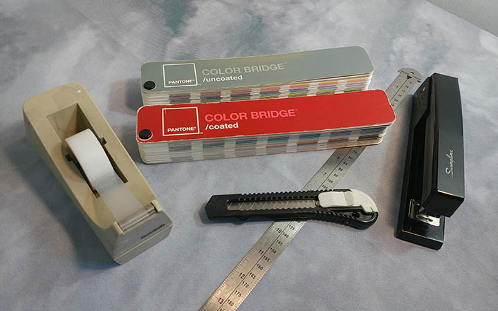
- A Sturdy Metal Ruler. A durable, reliable ruler will ensure you correctly measure samples and printouts. Find a ruler at least 12 inches long with indicators for inches and centimeters.
- A Magnifying Loupe. This will allow you to examine concerning details on sample prints without straining your eyes.
- A Basic Home or Office Printer. This will allow you to conveniently create draft prints without running down to a print shop! Even something as simple as an inexpensive, black-and-white laser printer will provide a wonderful reference toward your project’s composition.
- A Pantone Color Bridge Book. Pantone produces industry-standard color reference books. Their most comprehensive line is called the Color Bridge Series, which provides detailed formulas for most Pantone colors as they reproduce in print and digital forms.
- Stock Photos and Fonts. While some stock photos and fonts can be licensed through free repositories such as Pexels, Unsplash, and DaFont, they can have fewer results than premium resources such as Adobe Stock, Shutterstock, and Adobe Fonts. A small licensing fee for a specific stock photo or font can save you tons of time to dedicate toward other aspects of your design.
- A Dedicated Light Source. A dedicated light source allows you to fairly assess samples without outside factors affecting their appearance. Printed goods are typically viewed in one of two conditions: in offices with cooler white lighting and in homes with warmer white lighting. Purchase an inexpensive lamp with light bulbs that simulate these two settings and keep it positioned in a neutral location.
- A Razor, Cutting Mat, Tape, and Glue. Some assembly is required! If you plan on designing multi-page documents or projects with varying sizes, a few arts and crafts items can significantly speed up prototyping.
Tip #2: Design using a CMYK color space.

There are different sciences behind displaying the full color spectrum on computer screens and printed goods.
Computer screens start off black. To create images, pixels of projected red, green, and blue light are added to this black surface, eventually approaching white. This is known as the RGB color space.
In contrast, printed surfaces typically start off white. To create images, pigments of cyan, magenta, yellow (CMY) are applied to this white surface, eventually approaching black. A black (key) pigment is added to the image to aid in cleanly producing outlines and shadows, thus creating the CMYK color space.
While the CMYK color space can reproduce many colors, the unfortunate reality is that computer screens will display a wider, more vibrant range of colors—especially with green, purple, and orange hues. To mitigate any major color conversion errors, begin your design in your software’s simulated CMYK color space when available.
Please note that color is relative: no two computer screens or printers will display a defined color the same way. Computer screens can significantly vary in brightness, contrast, warmth, and vibrancy based on their manufacturer. Similarly, printed colors can vary based on the manufacturer, the type of ink or toner used, the lighting conditions of your reference room, the color and glossiness of the printing surface, and the climate of the production room while printing.

Most print shops allow you to purchase a hard copy proof in advance of your project’s full production. Hard copy proofs can be used as a central point of reference for the final production’s colors. For color critical projects, be prepared to tweak your design’s colors at least once so they print their best.
Tip #3: Design with your end product in mind.
Every project calls for different specifications—designing a business card will be a significantly different experience than designing a book, banner, or brochure.
First, draft your design through a series of doodles. Be sure to note any cuts, folds, creases, or perforations and how your content will flow around them. Next, make a physical mockup of your product. Measure, cut, fold, staple, and tape blank sheets of paper together to bring the product to life. This prototype is called a “dummy” in the printing world and can give you a tangible frame of reference for your project’s size and assembly.
Tip #4: Reference other printed work.
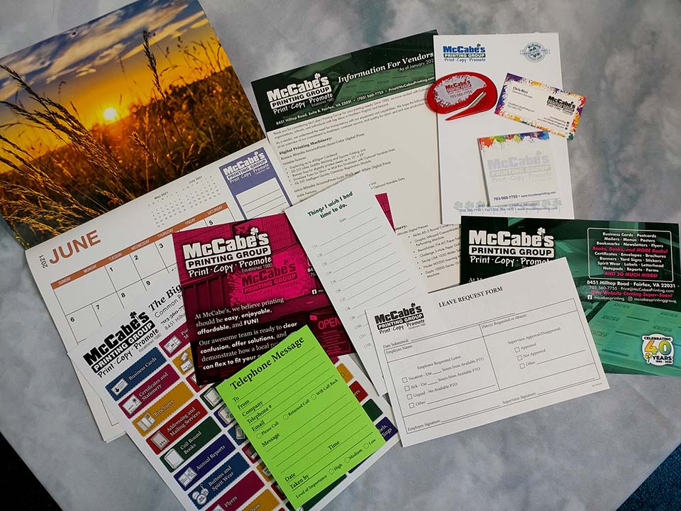
We encounter hundreds of printed goods at home, on-the-go, in the office, and at stores—why not catalog some of your favorites? Keep a tidy collection of printed samples such as business cards, postcards, booklets, brochures, packages, and labels in a binder, desk drawer, or bookshelf for easy reference.
Every collected sample should help inform your design choices toward sizing, spacing, color, and composition. Do your samples follow similar themes? How much spacing is around their content? Are they produced in black and white, full color, or with a limited color palette? Are they printed single sided or double sided? Are they mostly composed of pictures or text? Are they glossy or not glossy?
Tip #5: Start with the correct document size and spacing.
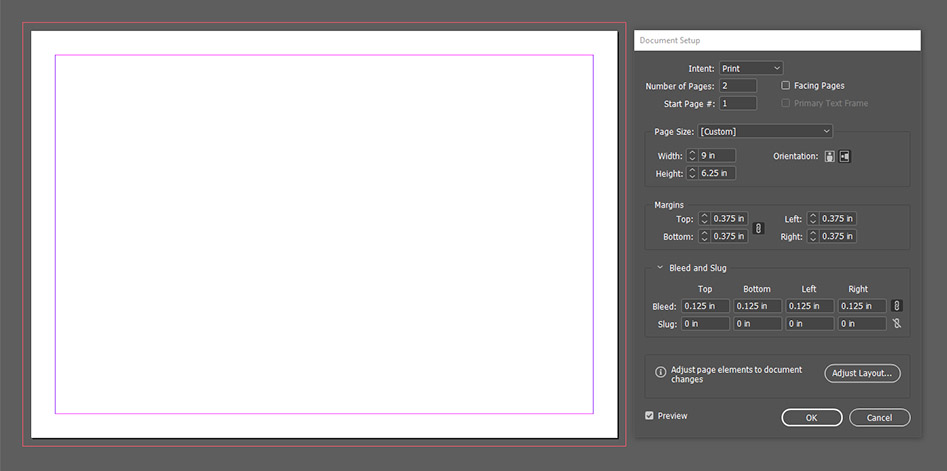
Printed goods come in different sizes based on their application. Business cards are typically 2” x 3.5” to fit into wallets, postcards are typically 4” x 6” to qualify for discounted postage rates, posters are typically 11” x 17” or larger to grab your attention, and so on. Do any of your print references from the previous tip follow certain sizes?
Designs printed in the United States are measured in inches instead of centimeters or millimeters and use names such as Letter (8.5” x 11”), Legal (8.5” x 14”), and Tabloid (11” x 17”) to describe their common sizes. Double check that your design software is operating in inches to prevent any costly resizing problems at the print shop!
Because of production sensitivity and human error, there will always be a small tolerance involved with a project’s finished size and trim position. As a result, there are two important margins that coincide with a project’s finished size: safety and bleed.

Safety margins prevent essential content from being lost on the trim, fold, score, and perforation lines of the finished project. Look at your print references again from the previous tip: most likely, there are no examples of projects that have essential text and graphics sitting directly on their trim and fold lines; instead, there is usually a pocket of space keeping essential content clean, cushioned, and optically centered.
A bleed margin is an extension of the background and border elements of your artwork that, under perfect circumstances, will not be visible in the final product. It is typically an eighth of an inch of content (0.125”) that extends past your design’s trim lines. If the project’s final trim is slightly off, the bleed margin prevents unprinted material from appearing near the product’s edges.
*** Need a quick reference on common print sizes? We list commonly ordered sizes for various print projects on our Products and Services page.
Tip #6: Keep your design elements consistent.
Regardless of your design software’s capabilities, there are two things that can be applied to any workflow to ensure you have consistent layouts, margins, fonts, color schemes, and similar design elements across your entire project.
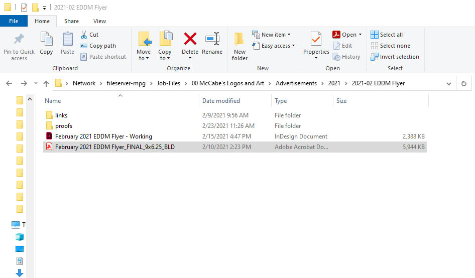
- Keep your project organized into one folder on your computer. To save on file size and loading times, most design software does not store every design element inside one file. Instead, design elements are “linked” from other locations on your computer. To prevent links from disappearing over time, keep your project’s documents, graphics, icons, and other essential elements stored in the same folder as your working file on your computer.
- Write down any consistent design elements on a notepad. If you plan on reusing certain fonts, colors, margins, and graphics, it never hurts to have a written reference cataloging their details. Make note of recurring elements and their values.
Additionally, most design software contains several features to keep your design consistent.
- If your design reuses headers, footers, and static graphics on multiple pages, then use master pages. When a master page is defined and modified, every page referencing the master page will automatically update. For example, a company’s letterhead can be placed on a master page to automatically appear on every page of a document.
- If your design features consistent color themes, then use color swatches. When a color swatch is defined and modified, every element referencing the defined color will automatically update. For example, a color swatch could be defined as C=100, M=60, Y=0, K=0 and applied to a paragraph of text; if the color swatch is redefined as C=0, M=100, Y=60, K=0, then the paragraph of text will automatically change color.
- To maintain consistent fonts, sizes, colors, hyphenation, and spacing for paragraphs, captions, and headings, use paragraph styles. When paragraph styles are defined and modified, any text referencing the paragraph style will automatically update. For example, this can change every paragraph in your design from 12pt Times New Roman Bold with indentations and hyphenation to 10pt Gill Sans Regular with no indentations or hyphenation.
- To maintain consistent highlights, accents, effects, and emphasis on select text, use character styles. Character styles are used to define consistent elements in words or lines of text. For example, an “emphasis” character style can be defined to change text from 12pt Times New Roman Regular to 12pt Times New Roman Bold Italic; like paragraph styles, you then have control over its parameters across your entire document.

Tip #7: If something is blurry on your screen, it will print blurry.
High quality prints require high resolution graphics.
The resolution of a graphic is the density of its data, measured in dots-per-inch (or dpi). Assume that your graphics should be at least 300dpi—300 pixels x 300 pixels per inch of content—for printed goods. When set up for print, lower resolution graphics such as those typically found on websites and social media will pixelate or blur resulting in a decrease in quality.

Tip #8: When in doubt, print it out.
Regardless of your printer’s maximum paper size, quality, or color capabilities, it never hurts to print your design after every major modification to confirm your choices of size and spacing.
As mentioned in Tip #2, once your project is nearing completion, any concerning elements can be addressed at a print shop by purchasing a hard copy proof. Hard copy proofs are a relatively small investment that can be used to confirm your project’s final print quality.
Tip #9: Give your print shop the right files!
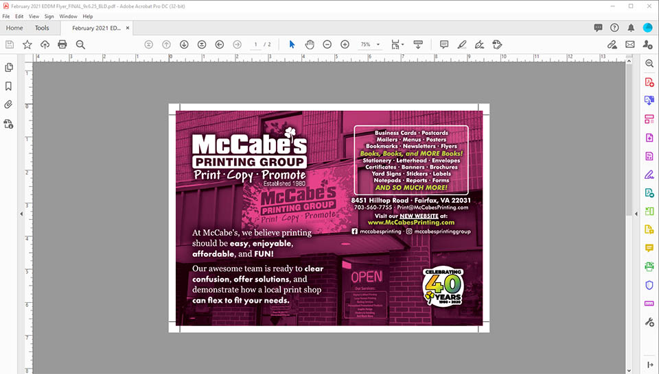
The universal “press ready” file format for printers is a PDF, which can be generated from most design, layout, and publication software. Every print shop has slightly different requirements for this PDF’s parameters, so chat with their team before hitting the final “send.” (Click here for McCabe’s Printing Group’s Project Artwork Checklist).
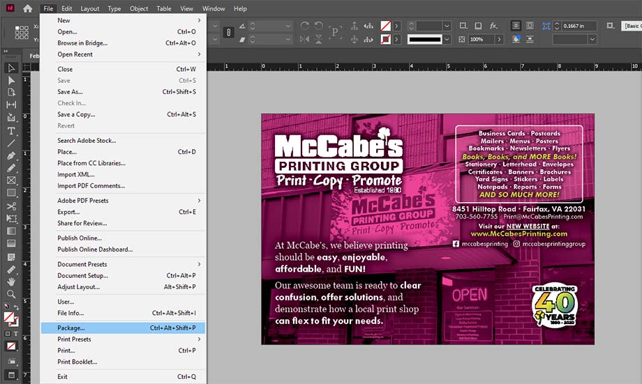
If anything in your design requires modification, a print shop may request a packaged version of your artwork. A packaged file contains your working file and every linked graphic and font used to create your design. A lot of design software has this packaging feature available as a one-button operation, including Adobe InDesign and Microsoft Publisher.
If you are collaborating with a print shop on a design, it is also important to supply them with the highest quality assets you have. This includes your project’s highest resolution graphics, properly named and organized files, and any company branding requirements.
Tip #10: Design to your comfort level and HAVE FUN!
Designing for print can be overwhelming. As with any artistic endeavor, it is easy to compare your work next to others’ and be overly critical of its elements. Practice makes perfect, so keep going! There is a good chance your first several designs will feature some mistakes that detract from the quality of your final project; note these problem areas and incorporate their changes into future projects.
Also, remember that we are here to help! At McCabe’s Printing Group, we aim to make every project easy and enjoyable regardless of its complexity. Please contact us with any design questions and we will set you up for success!
Remember: printing is meant to be FUN! :)

